
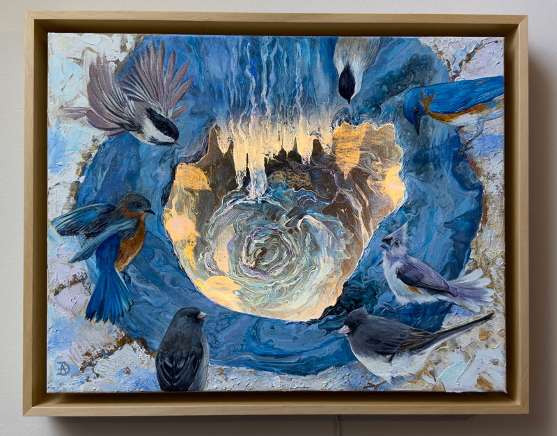
*** This blog post was first written during the pandemic, and focused mostly on “how blue colors change your mood when you stay at home for prolonged periods of time”. Since then, I updated it to reflect our current timeline and my own creative journey.
If you haven’t read my previous BLOG post about the blue color and why it’s the most popular color in the world, I invite you to read it as a preface to this blog post.
Let’s dive into my some fascinating facts and stories about BLUE. A pigment once reserved only to royals and divinity.
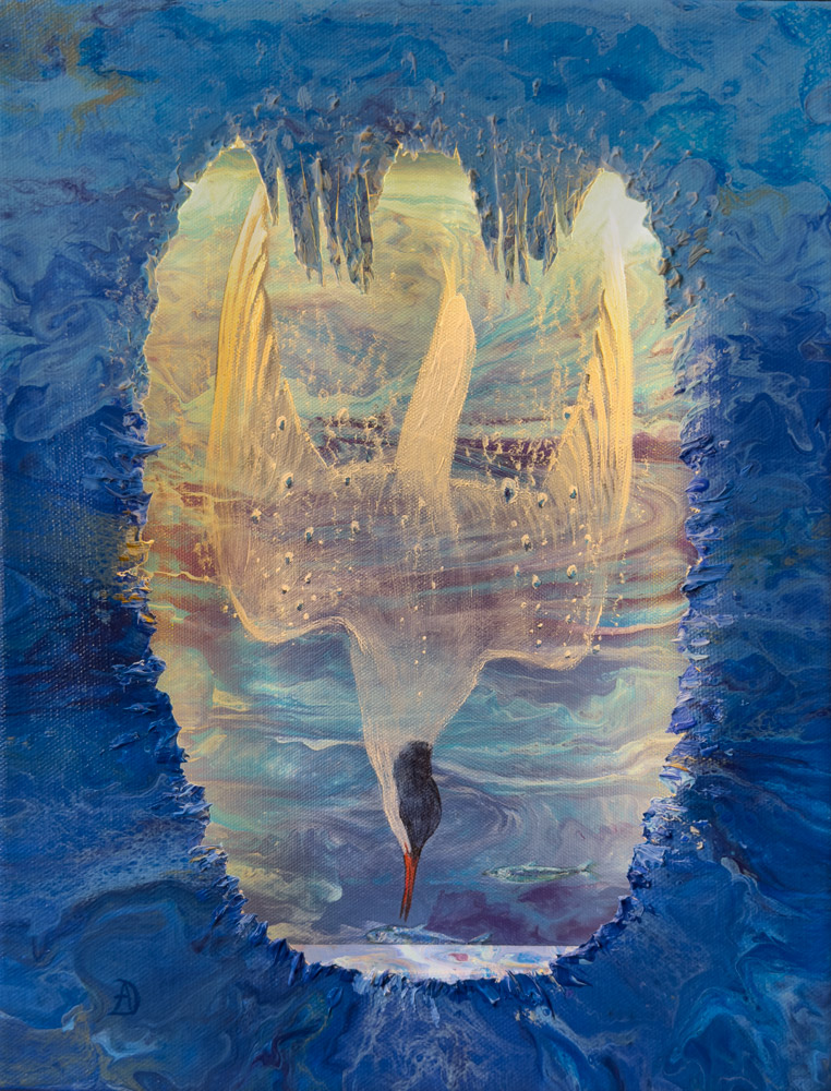
Deep Dive, acrylic on canvas and LED lights, Andreea Dumez
Dark blue can be depressive in large amounts
As a short recap, blue is calming, restorative, liberating. Blue exudes confidence and inspiration. But it is also chilling and too cool. Too much blue (especially dark blue), if used in excess, induces depression.
Think of that dark navy blue, almost indigo. The deeper and darker it is, the deeper the well.
A dark blue accent wall in your home is absolutely fine, and it can add a beautiful, elegant accent to the room. Add a brightly-colored artwork on top and the colors will pop against the blue backdrop.
But imagine painting all the walls in your house in this color… and spending large amounts of time indoors. The mood can become a bit… too oppressive.

Light blue colors – a happy mood
But the bright blue skies invite you to dream of freedom and the infinite possibilities of life. Imagine yourself lying on your back in a green field, looking up at the sky. How does that make you feel? The sky’s light blue symbolizes the free spirit, the unstoppable mind. Aptly named “cerulean blue”, from the Latin “caeruleus” = the color of the sky.

In between that dark blue and the cerulean of the sky lie many, many nuances. I will focus on two of them, mainly because of their historical importance: “Egyptian blue” and “Lapis Lazuli”:
Egyptian Blue
If you’ve read my previous post, I was discussing the fact that “blue” didn’t really exist as a word in the ancient world, except in Egypt. Some five thousand years ago, Egyptians figured out a way to melt together sand, copper, lime, and a local alkali called natron. Depending on the proportions of the mixture, the blue could be intense, toward ultramarine, or more diluted, with splendid blue-green nuances. Here is a a quick image search display of its various color ranges.
In ancient Egyptian culture, the color blue held deep religious and cosmological significance. It represented the universe, the endless sky and the primordial waters of the Nile River. It was a color reserved for the gods and the royalty.
Both this manufactured version of blue and the natural stone called Lapis Lazuli were used in ancient Egyptian art, for many millennia. The advantage of this copper silicate version was the cheaper production cost, rather than importing the Lapis all the way from Asia.
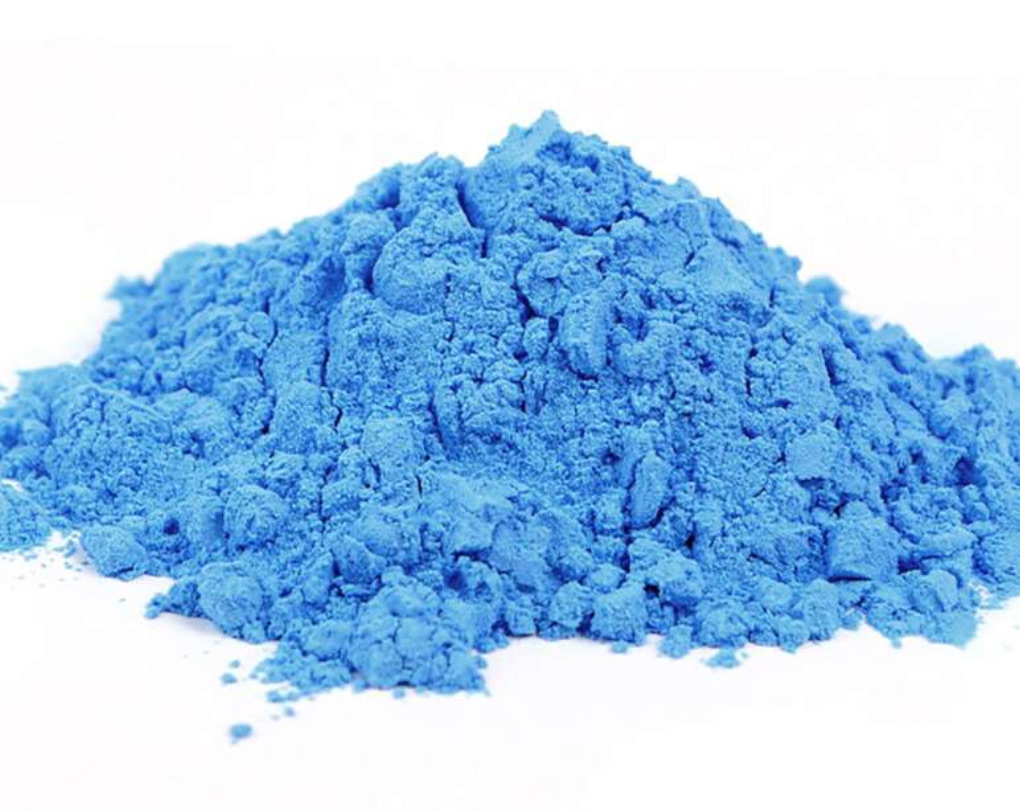
Below is the contemporary version of the pigment, available at naturalpigments.com:
What is Lapis Lazuli?
In my previous post about blue, I mentioned some blue pastel sticks from my studio, and I promised to come back with a bit of history about the origins of one of the most sought-after blue colors during Renaissance–the Lapis Lazuli blue. I found this stone to be an inspiration and a reminder to stay strong during hard times.

The rarest of all natural colors, yet the most beloved color, blue comes in a myriad of chemical options in our modern times. Yet that was not the case not long ago, before artists could squeeze it from a tube on their palette. I learned from school that the most precious type of blue pigment used to be ultramarine, a powder obtained from grinding a stone called Lapis Lazuli, mined from Afghanistan during the Renaissance times. Here’s a great resource about it on the Natural Pigments website (scroll down to the Origin and History of Use).
The ultramarine paint that came from Lapis Lazuli gets its name from Italy. Oltramarino means literally “beyond the seas”, and as I found out from a book that I’ll talk about in the next section, the term was not used only for this particular color. It was a general term for imported goods that came from beyond the seas.
A book worth reading
Here’s an intriguingly adventurous book that I recently stumbled upon, called “Color: A Natural History of the Palette”, by Victoria Finlay. The author took some of the most treacherous journeys around the globe, traveled on donkeys and rode in old Russian jeeps, in search of the original sources of colors, as she uncovered the most fascinating stories about pigments. I acquired a deep admiration for this inquisitive and brave woman. Just reading the story about her trip into Afghanistan gave me chills (a trip which was done during two separate journeys, during some of the most treacherous times–in the early 2000’s). But the revelations about the mines and the lives of the people in those isolated corners of Earth are fascinating.
These ancient mines where the oldest Lapis stones are shipped from are called Sar-e-Sang (the Place of the Stone). The locals know at what hours of the day to inspect a Lapis stone in order to grade its quality.
This glorious description of the valley of Sar-e-Sang is priceless: “For as far back along the side valley as I could see, the white rocks were flecked gloriously with blue. I stood in the icy water for as long as I could, enjoying the colored rocks shimmering in the early morning sun around me. [ ] Once upon a time this whole side valley would have been a blue rock garden, just waiting for people to enjoy it.” (Color: A Natural History of the Palette, Victoria Finlay, 2002).
–> Here and here you can see a few pictures of Sar-e-Sang, along with some really interesting details and stories about the mines.
Old blue vs new blue
The natural Lapis pigment lost its status in 1828, when the French came up with its synthetic version, ultramarine.
I have worked with both pigments, the natural one (from NaturalPigments.com) and the synthetic version. Obviously, the natural pigment does not have the same coverage strength. The synthetic pigment is more opaque, more dense, has better coloring properties. But, evidently, there is a caveat: it tends to be too intense if used straight out of the tube; it needs to be diluted or brightened by other pigments to show its true hue.
My natural pigment, on the other side, has an uneven yet distinctive spark to it. It does not reflect the light evenly, meaning it does not look flat or boring at all. It looks, well, to be honest, it looks precious. Many years ago, I had the honor of painting a few icons using the Lapis pigment and I tried to emulate the old masters techniques as much as I could. Layer upon layer, the tiny speckles of pigment intensify each other, giving the painting the aspect of jewelry.
Below are the icons of Archangels Michael and Gabriel painted by me and inspired by master Andrei Rublev’s works from the 1400.

This blue piece of stone has traveled all the way to me from a remote part of the world: extracted from a blue mountain by Afghan miners, then followed the same ancient route it has taken across the world for millennia.

Lapis Lazuli symbolizes wisdom, truth, nobility. It is often called “The Stone of Wisdom”. Once only reserved for pharaohs and royalty, Lapis Lazuli has been found in ancient artifacts, including the funeral mask of Tutankhamun.
One of my absolute favorite artists, Johannes Vermeer, used lapis lazuli in his paintings–famously in “The Girl with the Pearl Earring.”
Lapis Lazuli is, indirectly, via Persian and Arabic, the root name for the word “azure” in both English and French, as well as “azul” in Spanish and Portuguese.
Ultramarine blue has an uplifting, rejuvenating effect on the eye. Although darker in tone than cerulean, it leans slightly toward the red (violet) end of the color spectrum. This warmth provides an energetic quality that inspires imagination, deep concentration, and a sense of ultimate freedom. It carries an underlying feeling of infinite peace and harmony. Ultramarine is known to induce a “blue mind” state, lowering your pulse and slowing breathing. Chromatherapists often utilize it to help ease anxiety, panic, and everyday stress.
And because my favorite backyard bird is the Eastern bluebird, I wrap up my discussion about blue with a gold-leaf-embellished giclée print of a pair of bluebirds. They exude a sense of peace and inner balance:
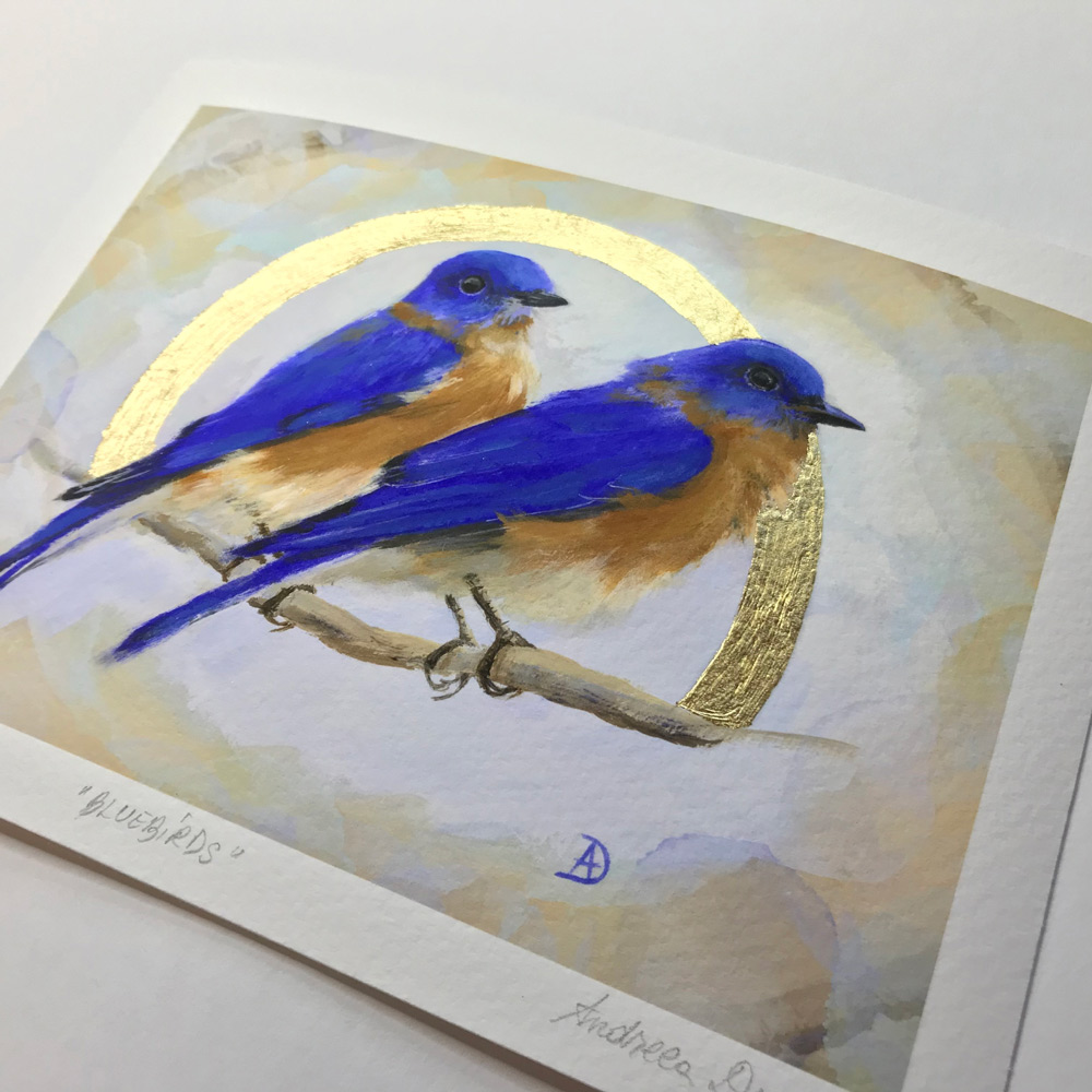
“Pair of Bluebirds”, Limited edition art print with gold leaf, Andreea Dumez
Symbolic meaning of different blue hues:


I love this, Andreea. Happy to have connected with your blog!
Thank you, Kristine! So glad you are enjoying my posts!